Hey! I'm Mitch Ran, a graphic designer bringing projects to life with standout identities.

I am a designer from just north of Cincinnati, Ohio, USA. From childhood play to assignments in high school, I have always been passionate about building effective branding around projects I work on. In 2023 I received a degree in Communications Design from the University of Cincinnati.Throughout my education and experiences as a designer, I have worked with a wide range of programs within the Adobe Creative Suite and Affinity Creative Suite, as well as a wide range of animation, video, and productivity software. Color theory, typography, and consistency are key considerations in everything I create. Much of my work has been seen and recognized across social media by a worldwide audience.In addition to my primary focus in graphic design, I also have skills in illustration, animation, video editing, and frontend web design.Design motivates me because I can immerse myself in a story, cause, or brand, identify needs, and find solutions in a calculated yet imaginative way. In doing so, I become a part of something bigger than myself, and that is one of the best feelings in the world.Thank you for stopping by!
P.S. When not designing, I also enjoy music production and voice acting!
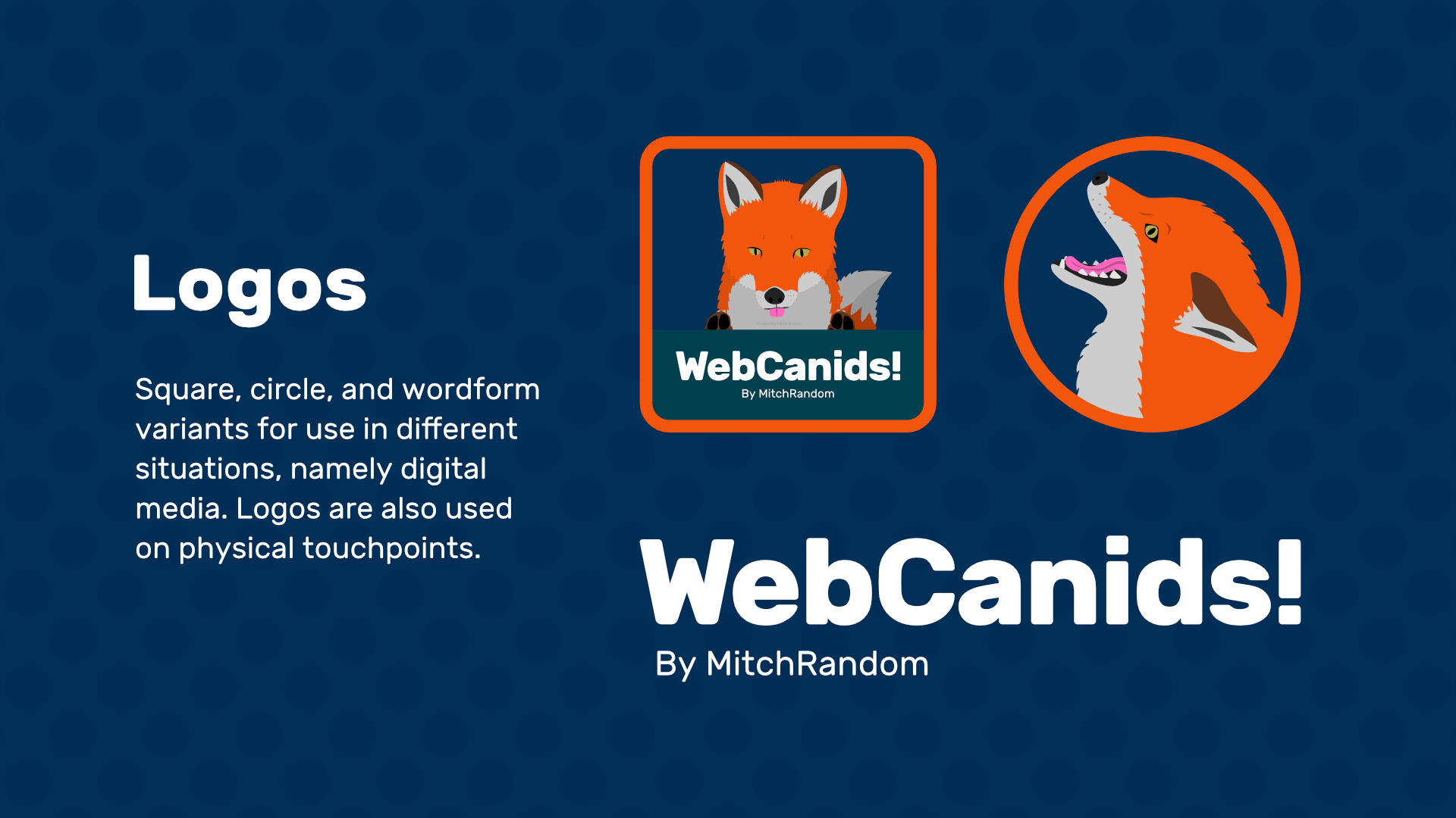
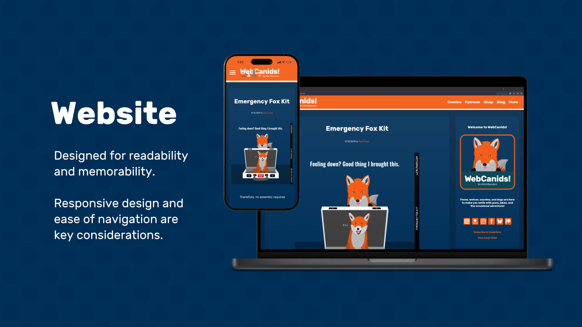
WebCanids! ComicsWebCanids! is a webcomic series featuring canids such as foxes, wolves, coyotes, and dogs. Consisting of short comedic skits and puns, the primary goal of the comic brand is to provide entertainment to a large audience spanning a wide range of backgrounds. When designing initial branding styles for WebCanids, a number of considerations came into play.
ChallengesThe world of webcomics is extremely competitive, necessitating eyecatching yet simple branding to maximize reach and engagement. The topic of the comic needs to be clearly evident while remaining aesthetically pleasing and approachable.
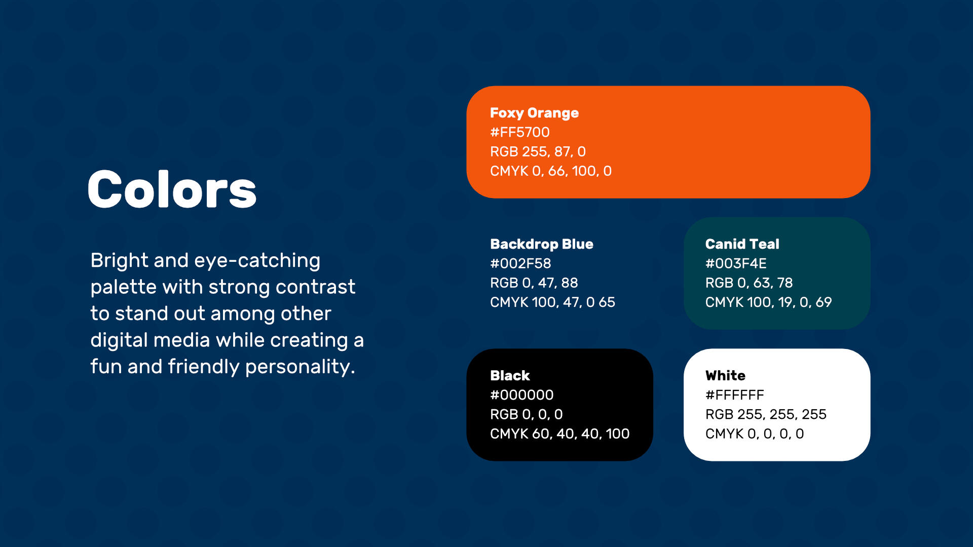
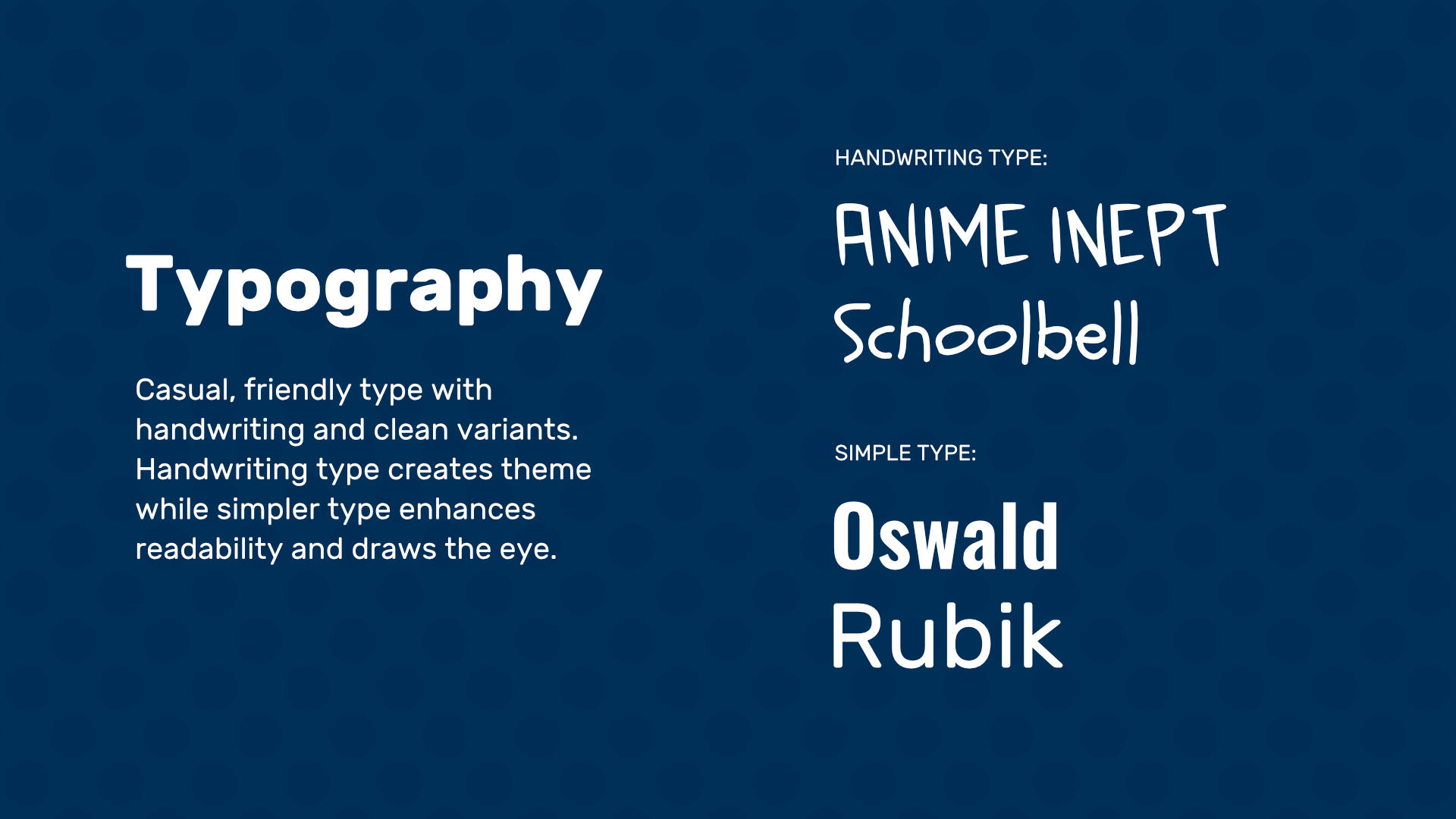
ResultsA simple yet cohesive logo set focused around a red fox and the title of the comic. From here, style guides were developed and used to design a full website and numerous merchandise offerings. The use of near-complementary colors including the same orange used in some character designs allowed the brand to pop across various applications and touchpoints.


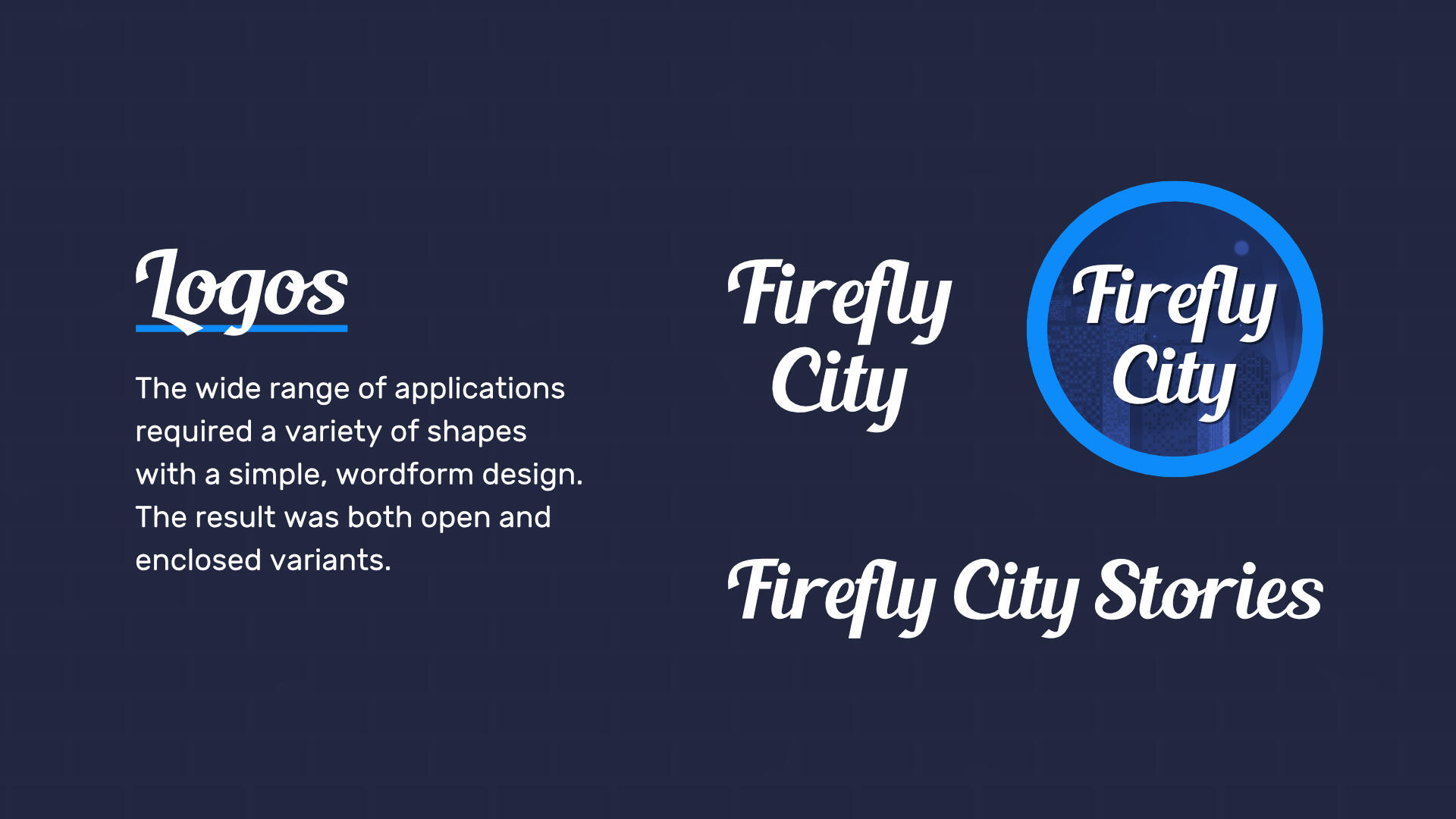
Firefly City StoriesFirefly City Stories is a collection (or anthology) of comics, animations, and other media set in the fictional location of Firefly City and its surroundings. Each subproject explores aspects of young adult (and later) life, and focuses on how the different mindsets, experiences, and stories of characters can intertwine, mix, and affect each other.
ChallengesFirefly City Stories is a mixed media brand, spanning both video and static content, and thus any branding needs to be usable in all possible digital formats as well as print. Furthermore, a new brand identity needs to stand out among other entities in a variety of extremely competitive fields such as the comics industry, animation industry, and music industry.
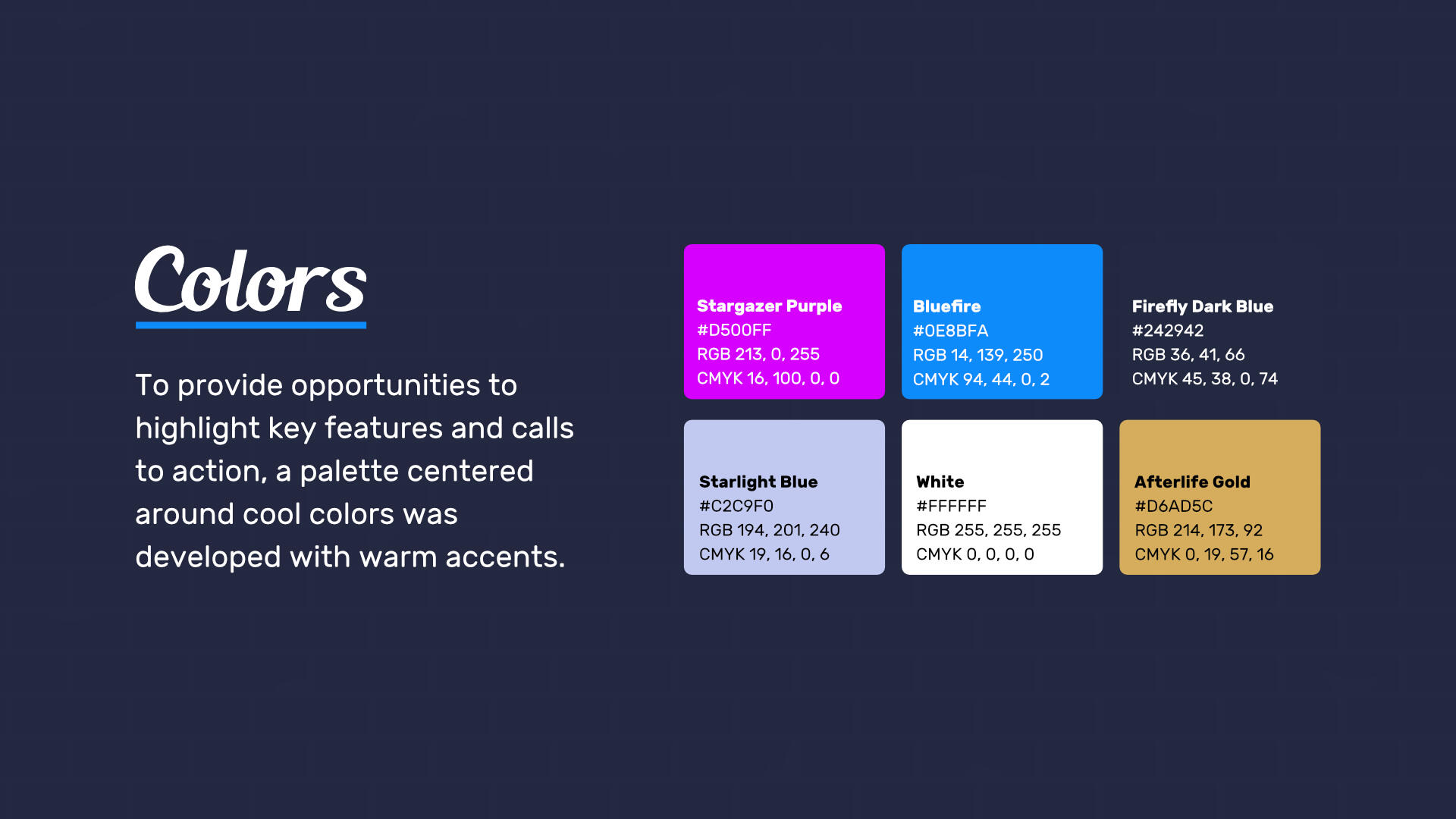
ResultsDevelopment of a set of high-contrast colors and a flexible logo set allowed for efficient and effective creation of touchpoint, website, and promotional material. The simplicity of the overall brand allowed for recognizability across a wide range of platforms and mediums, while still allowing enough versatility to highlight key offerings, announcements, and events without going beyond established guidelines.
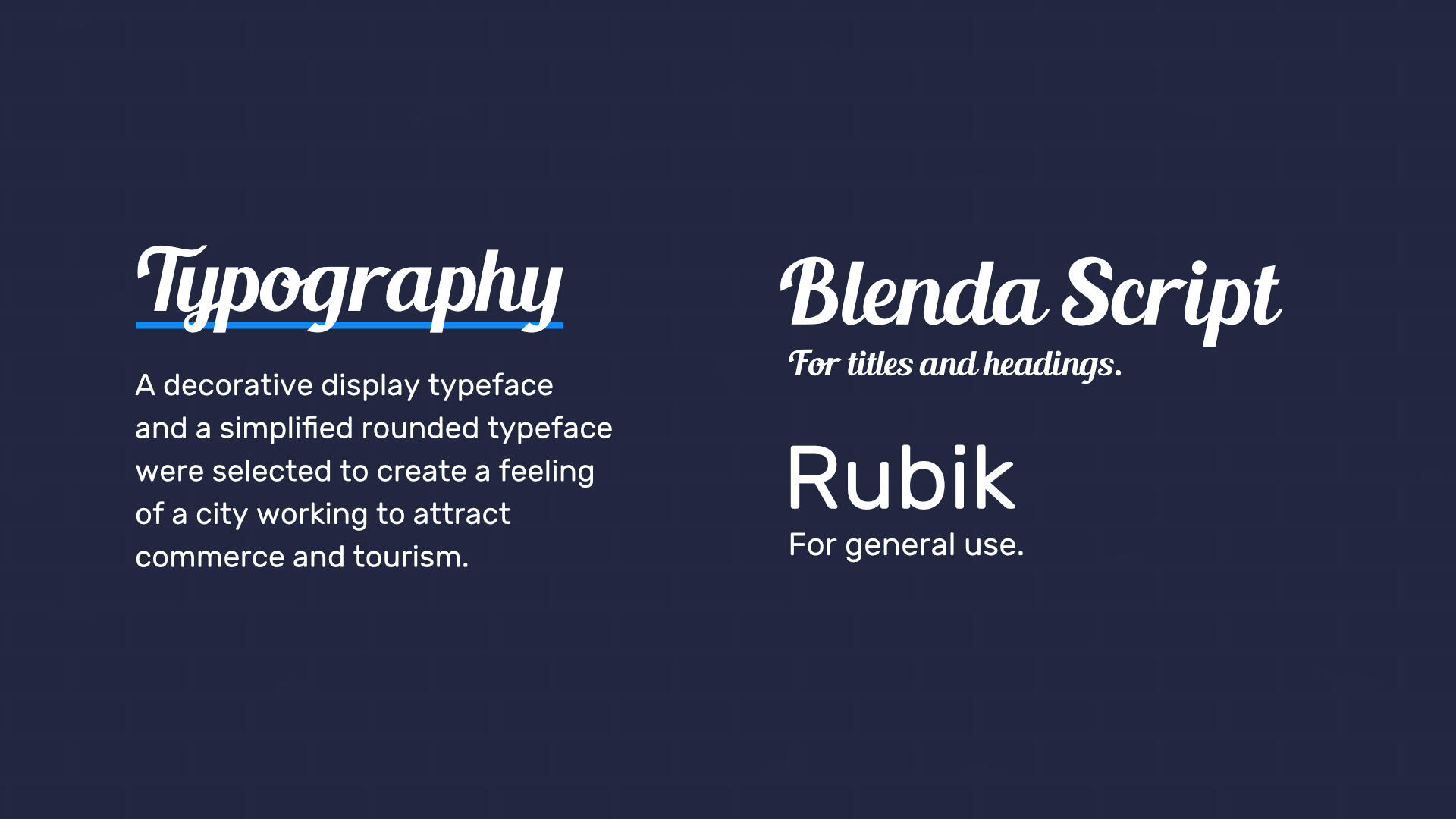
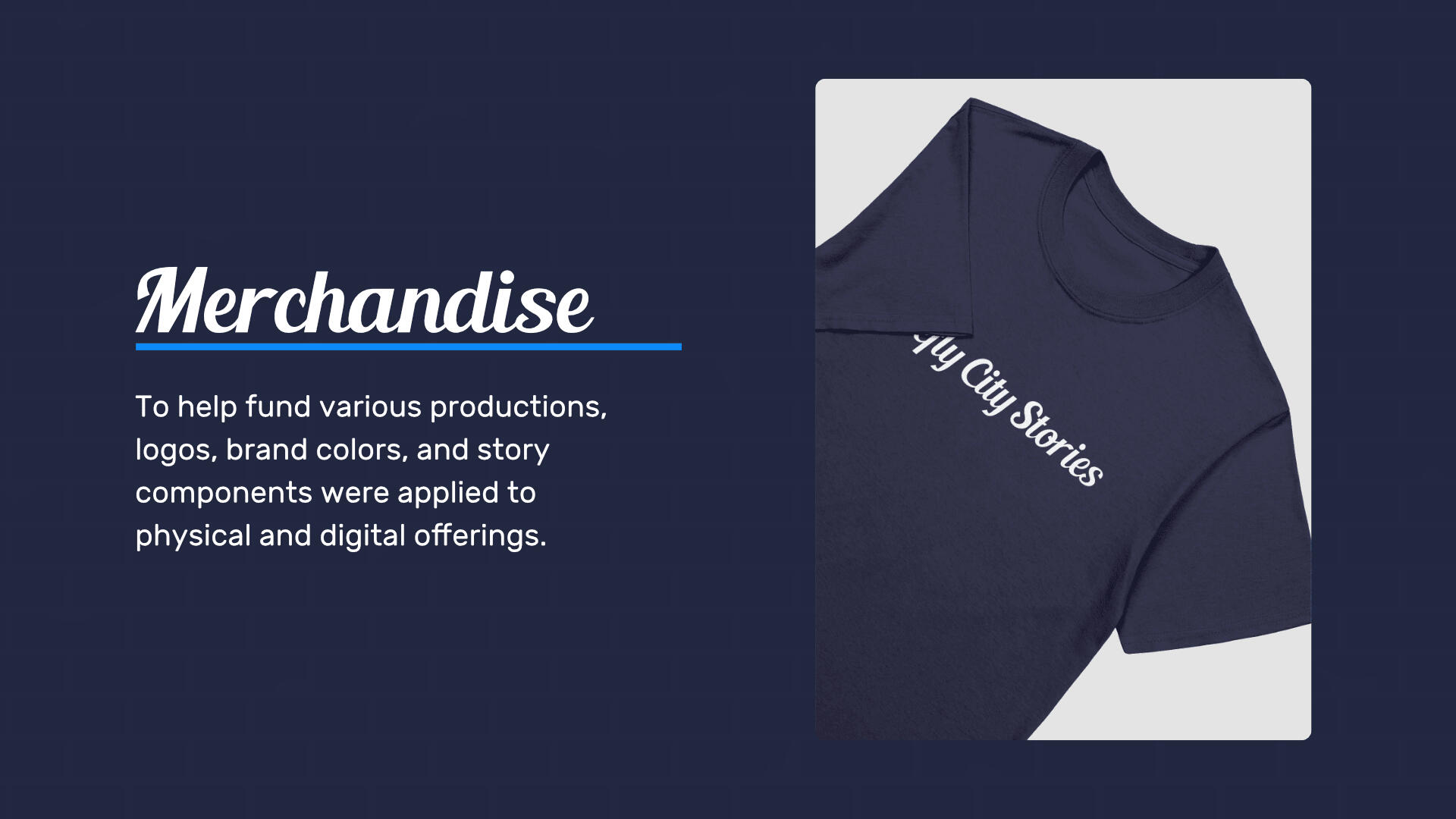
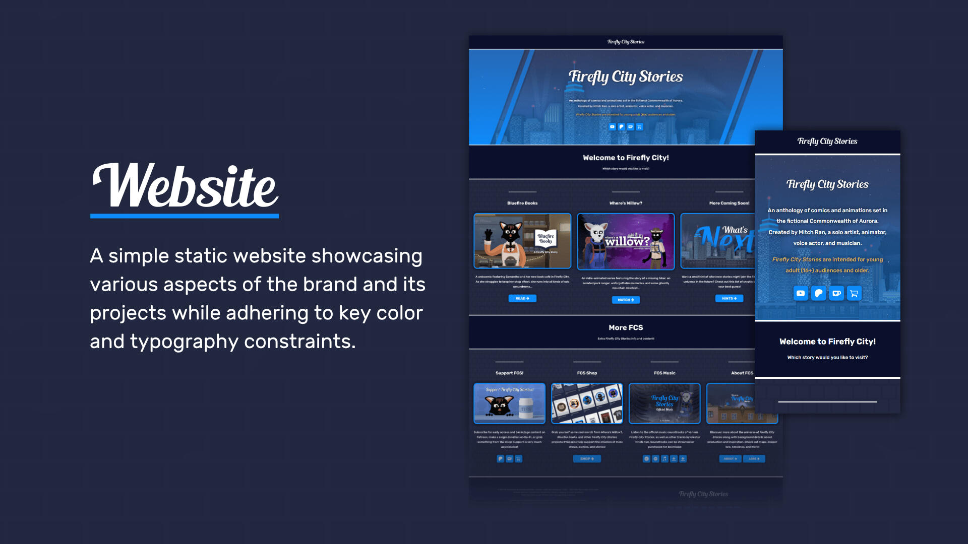
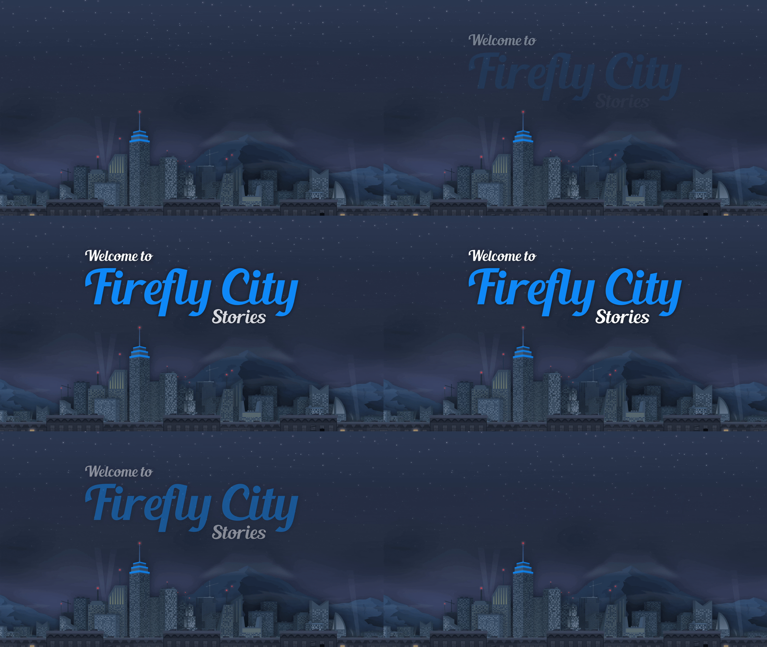
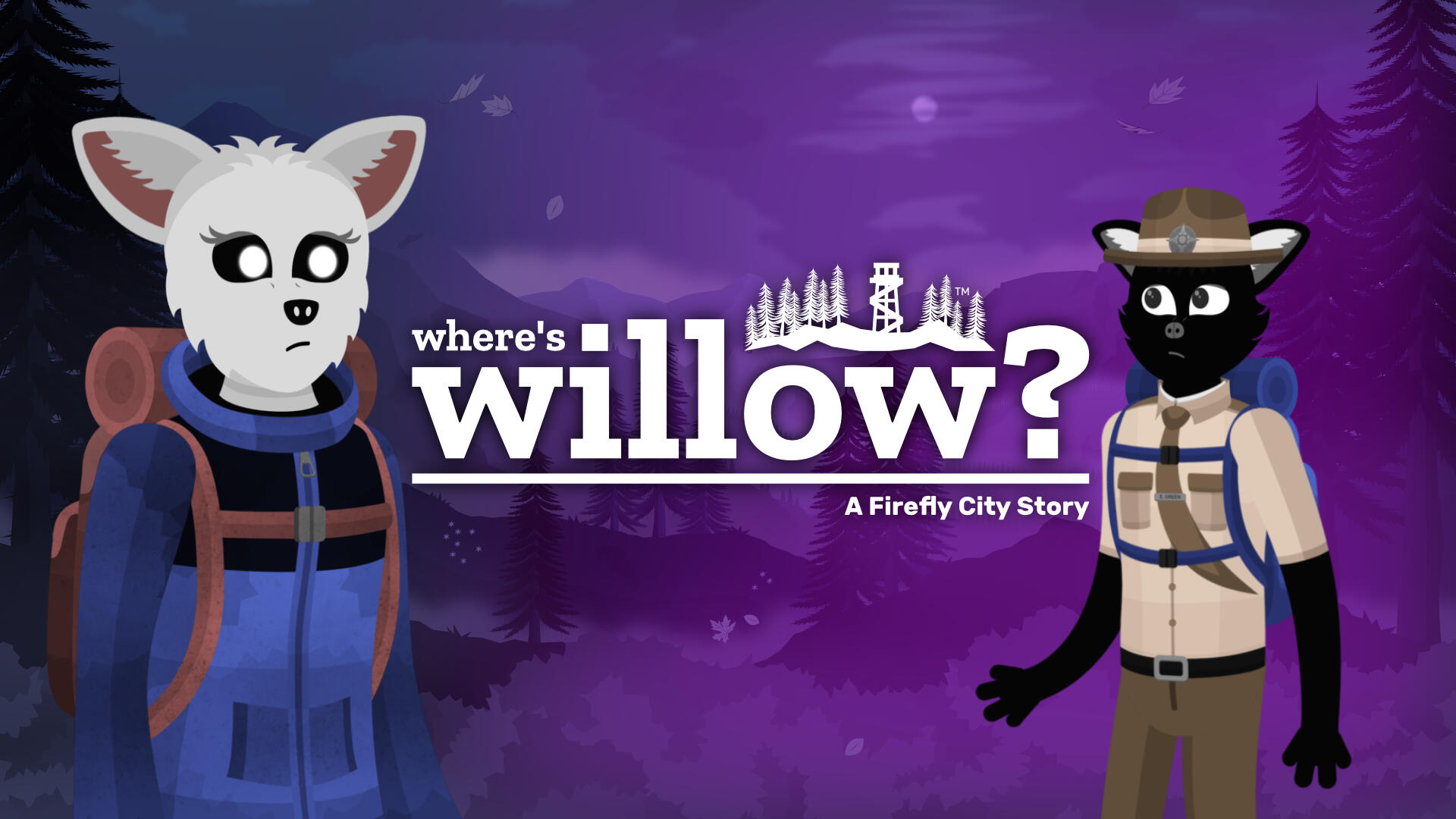
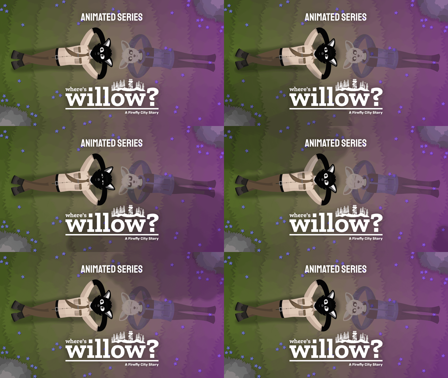
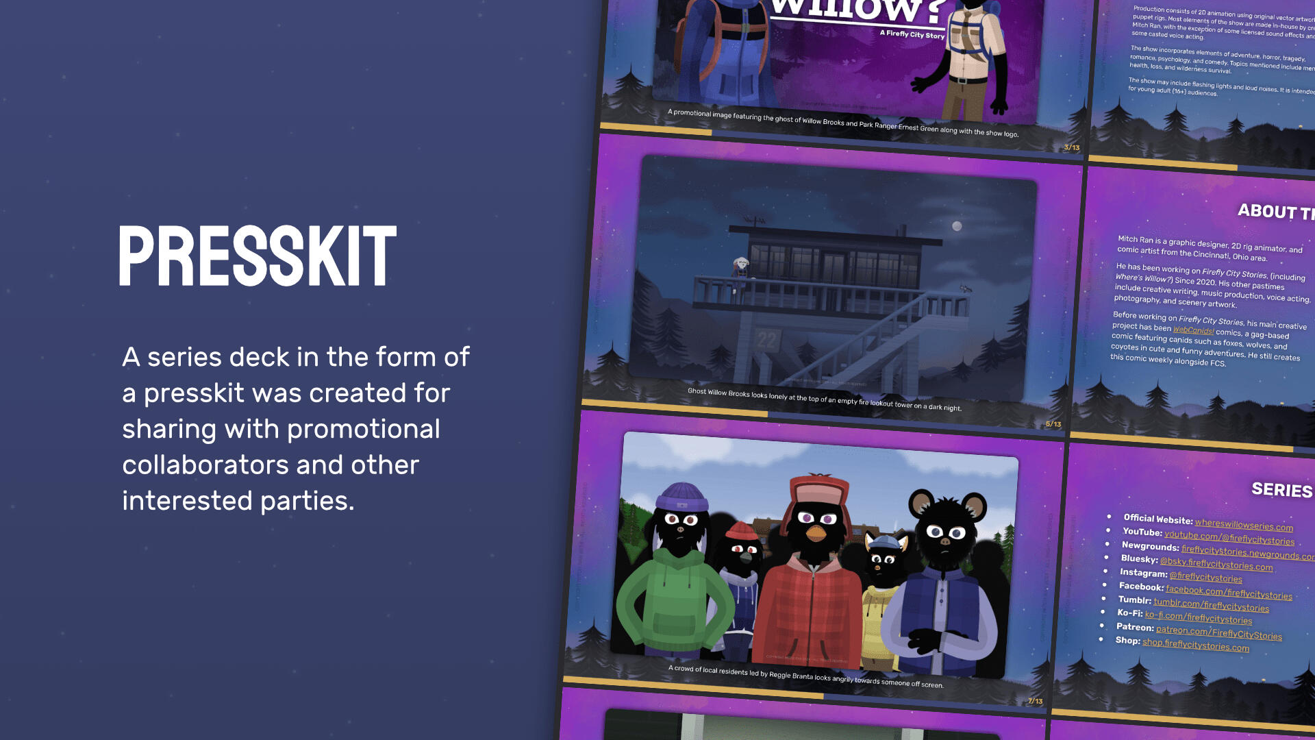
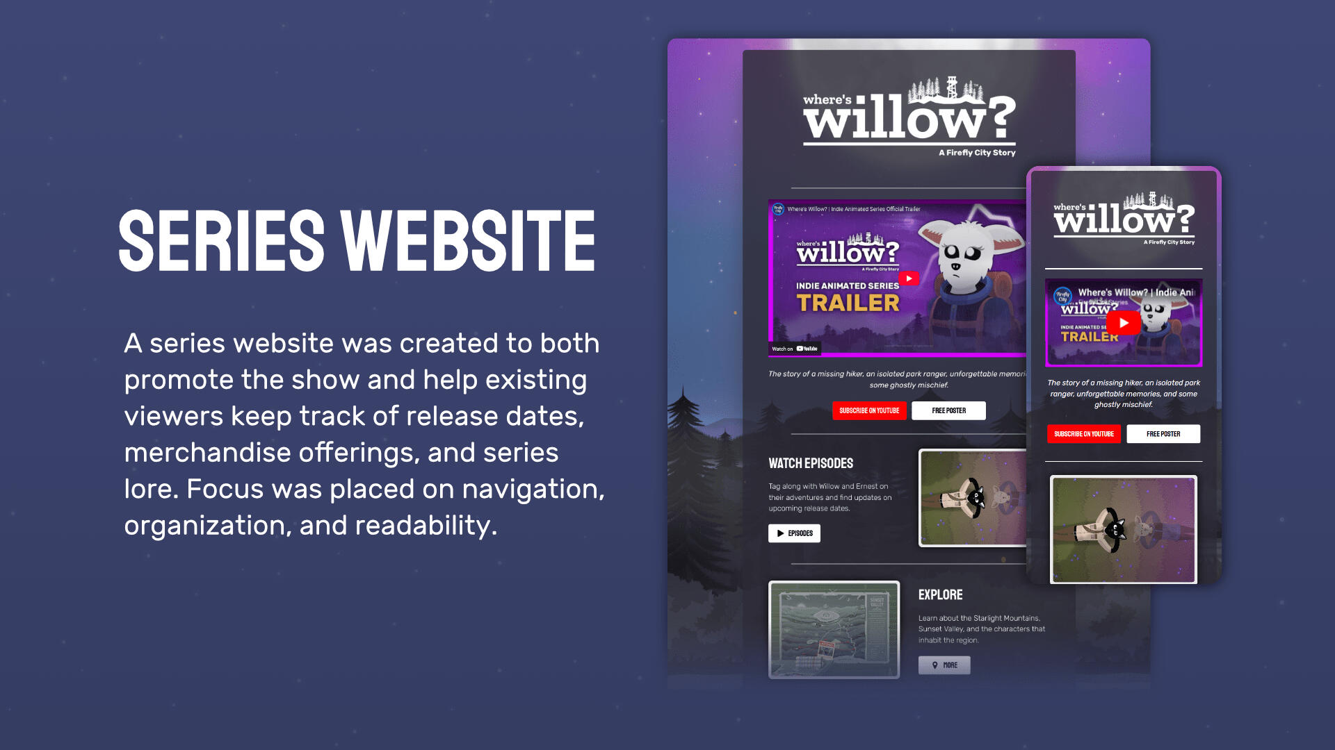
Where's Willow?Where’s Willow? - A Firefly City Story is an animated cartoon series about the ghost of a missing hiker who roams the wilderness of a vast national park. When she crosses paths with an isolated park ranger who blames himself for her demise, the two embark on a journey of adventure, understanding, and mischief that will guide them both through some of life’s greatest challenges… and beyond.
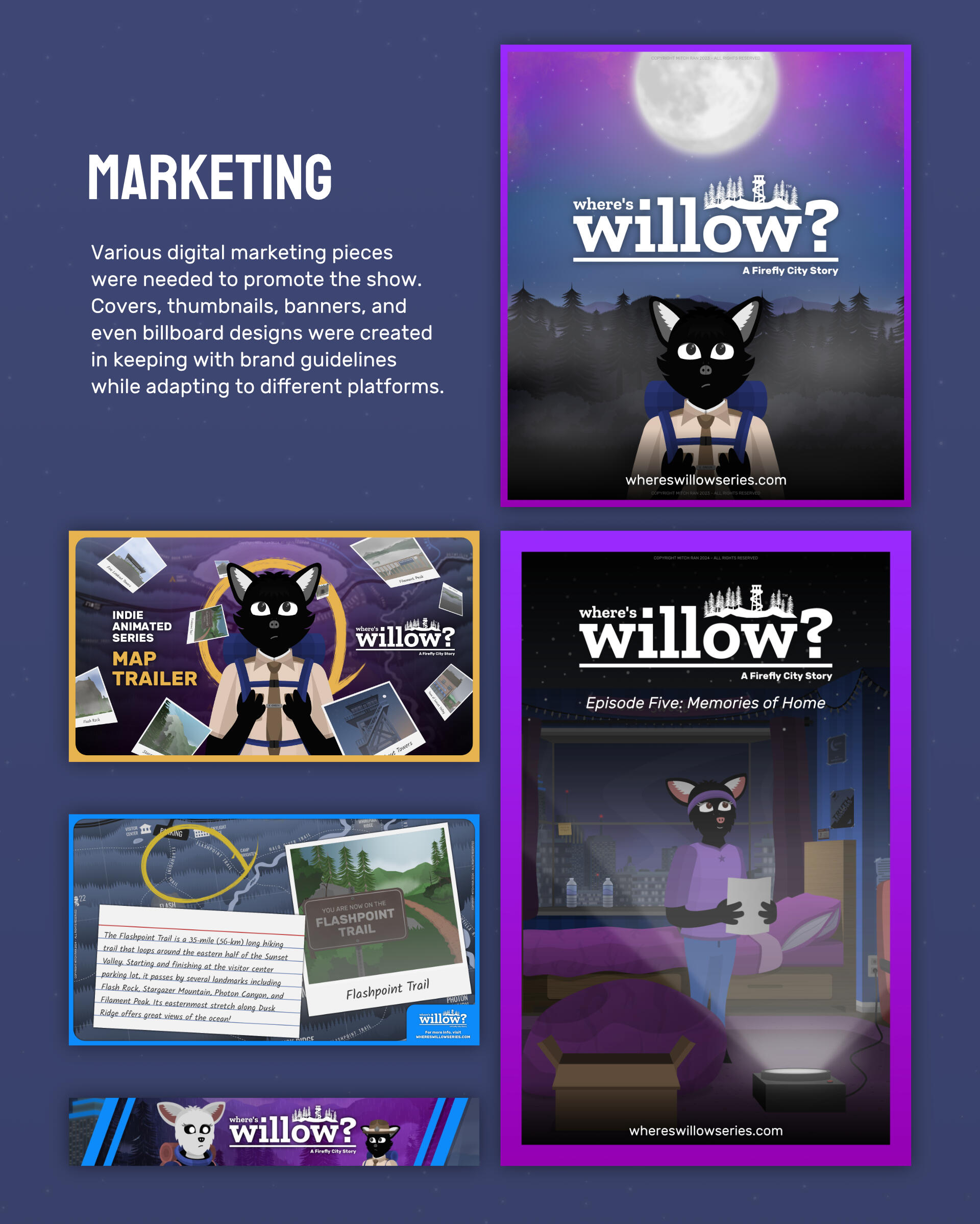
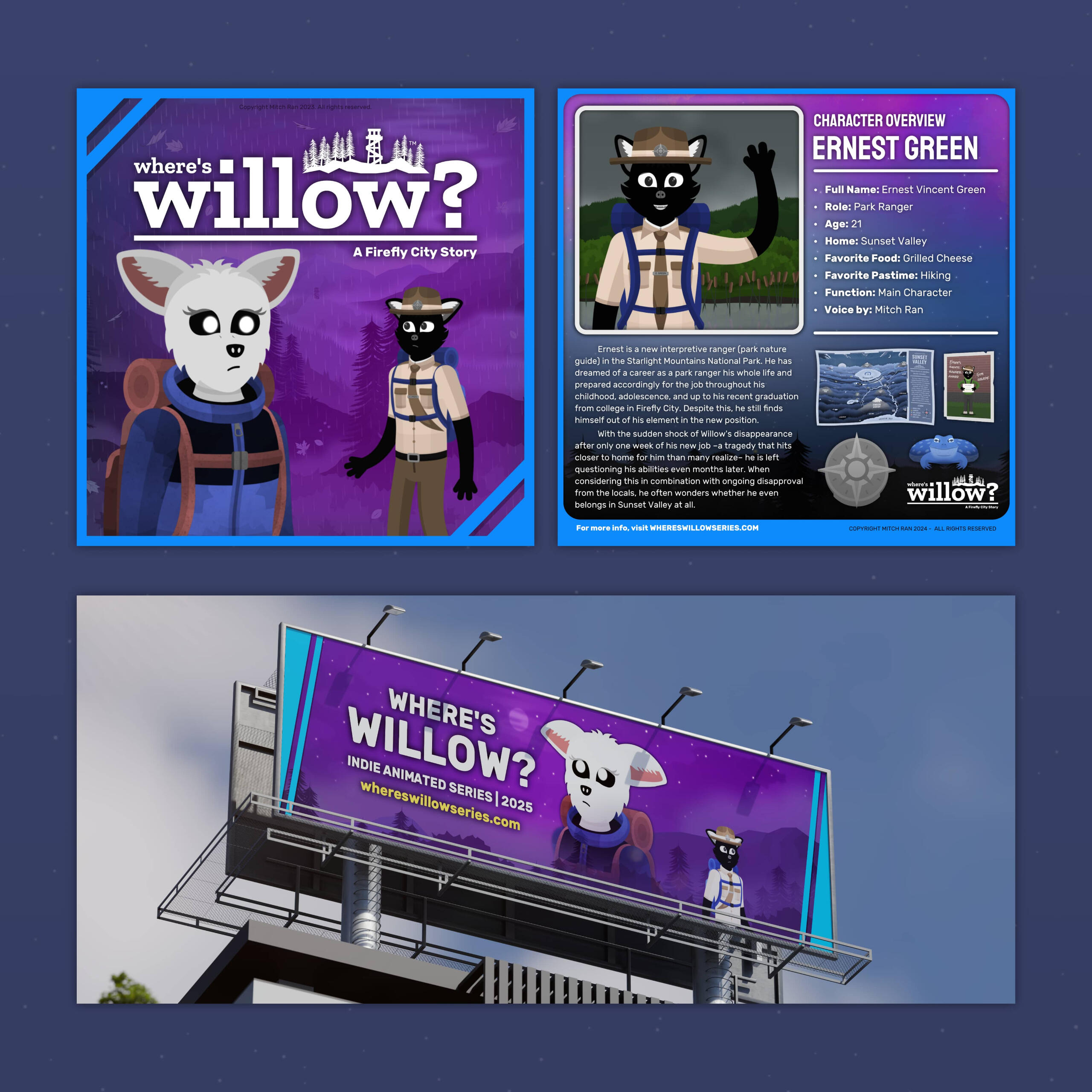
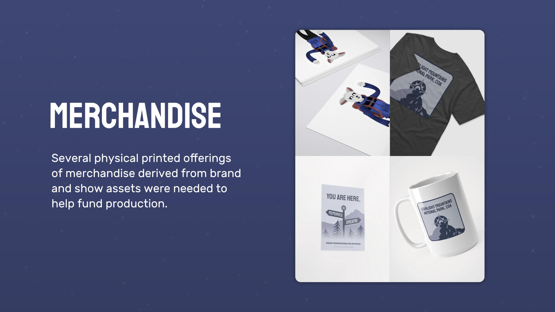
ChallengesCreating a brand identity and related marketing material for an animated series requires a high degree of consistency and interconnectivity to ensure that audiences become familiar with the story being presented. Elements of design may also appear in the show itself, and vice-versa. Necessary applications range from digital marketing materials to physical merchandise and large-scale advertising visuals.
ResultsWork on the show and its brand identity resulted in a consistent yet comprehensive array of design materials that were used in production, on social media, in merchandise, and on physical advertisements. Audiences from a wide background recognized and took interest in the show over its promotional and release periods, resulting in further anticipation for future stories.
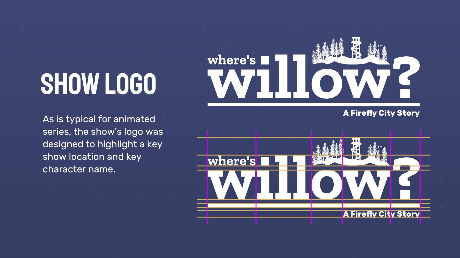
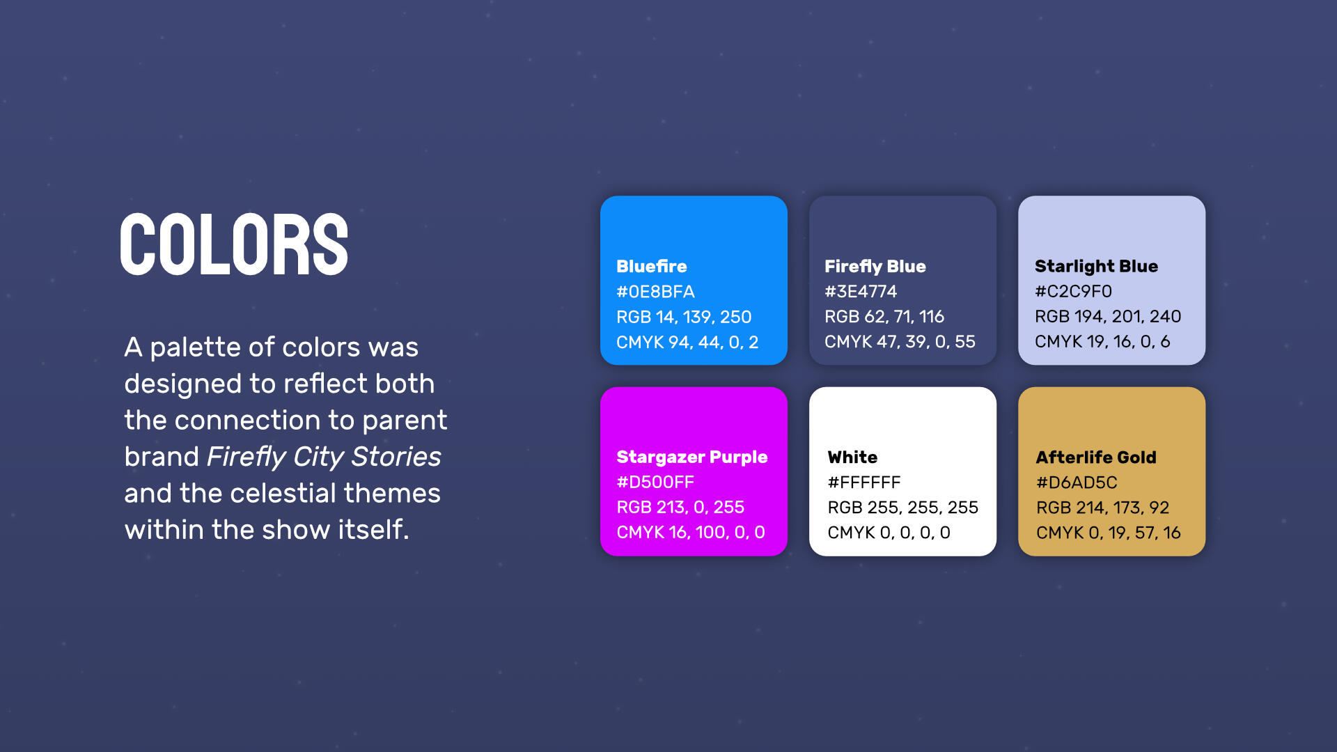
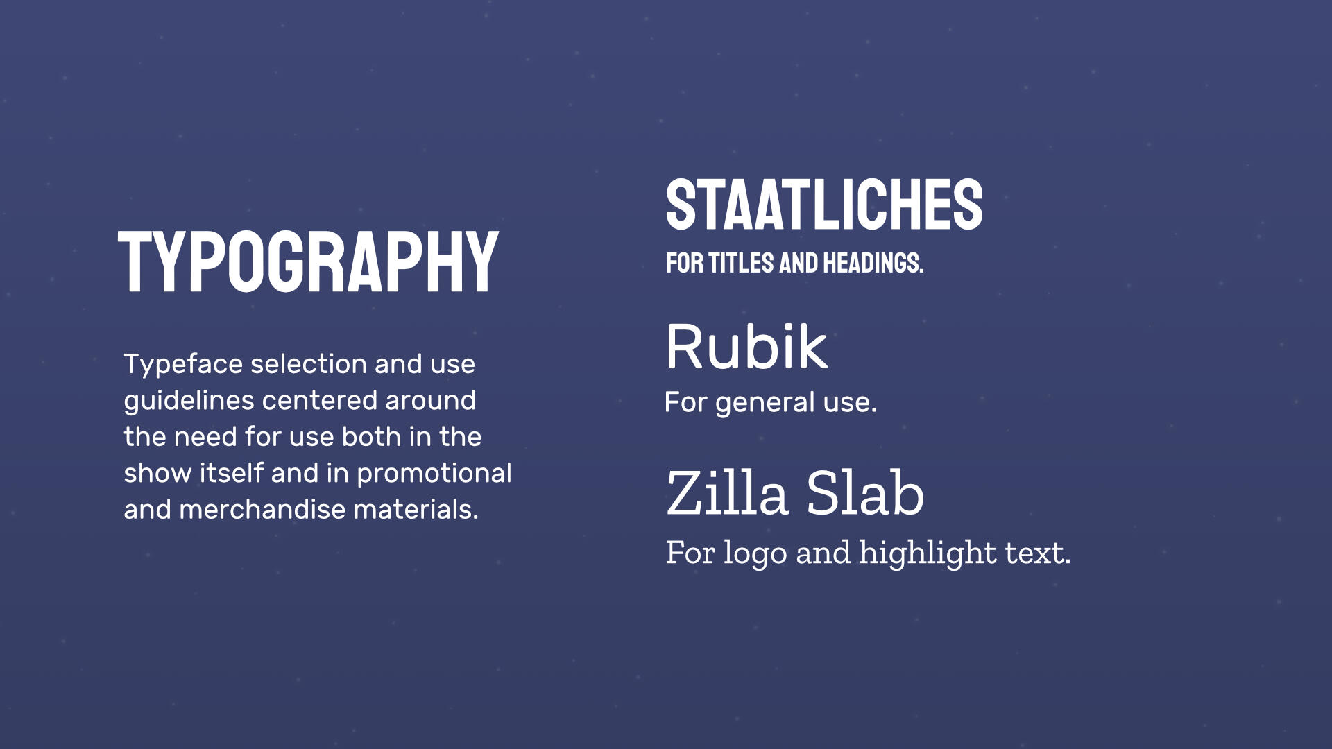
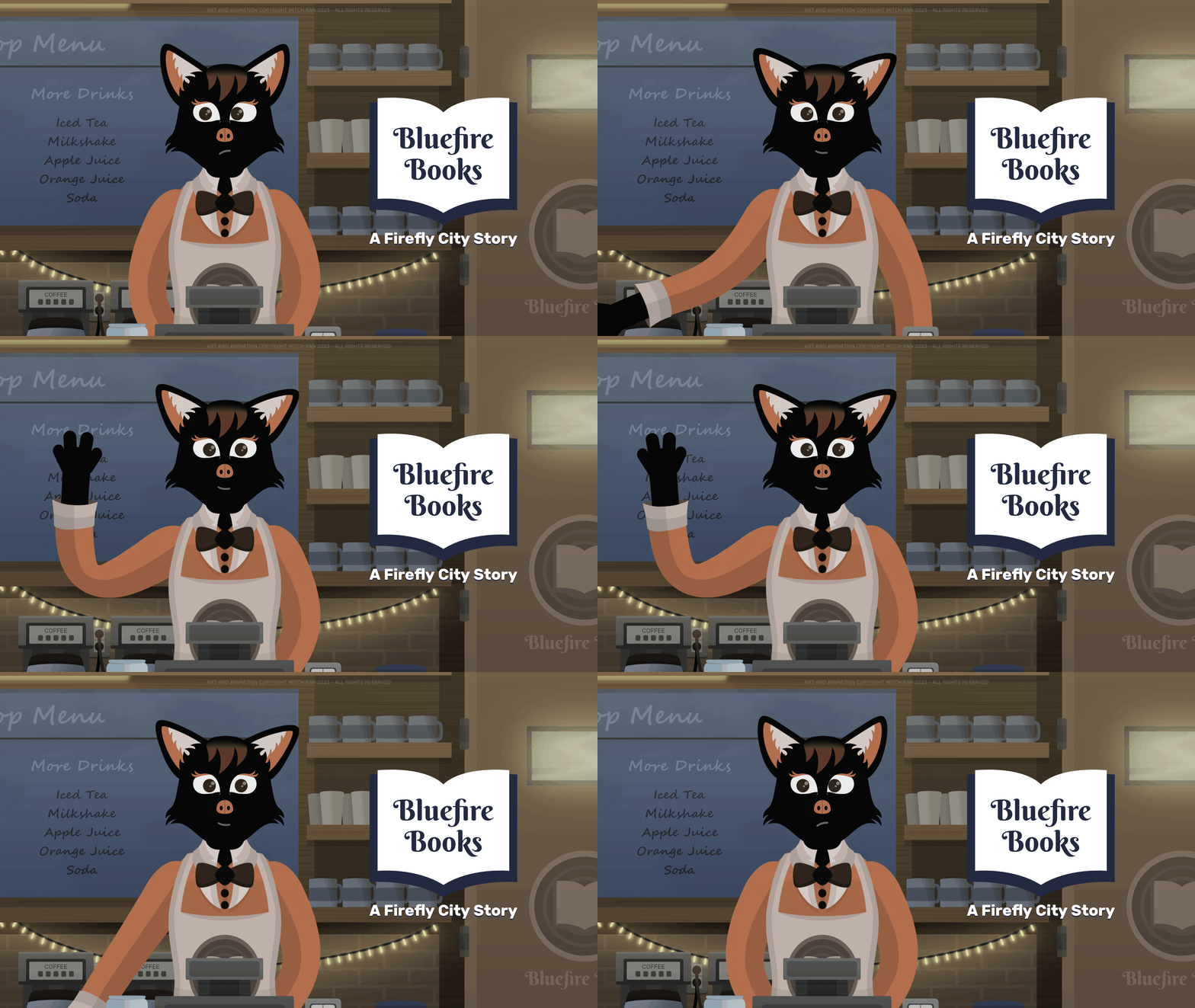
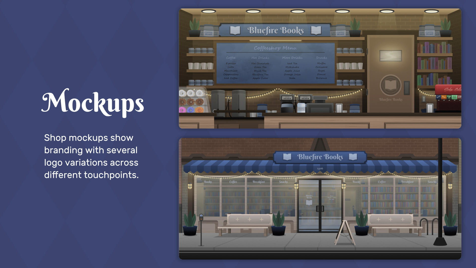
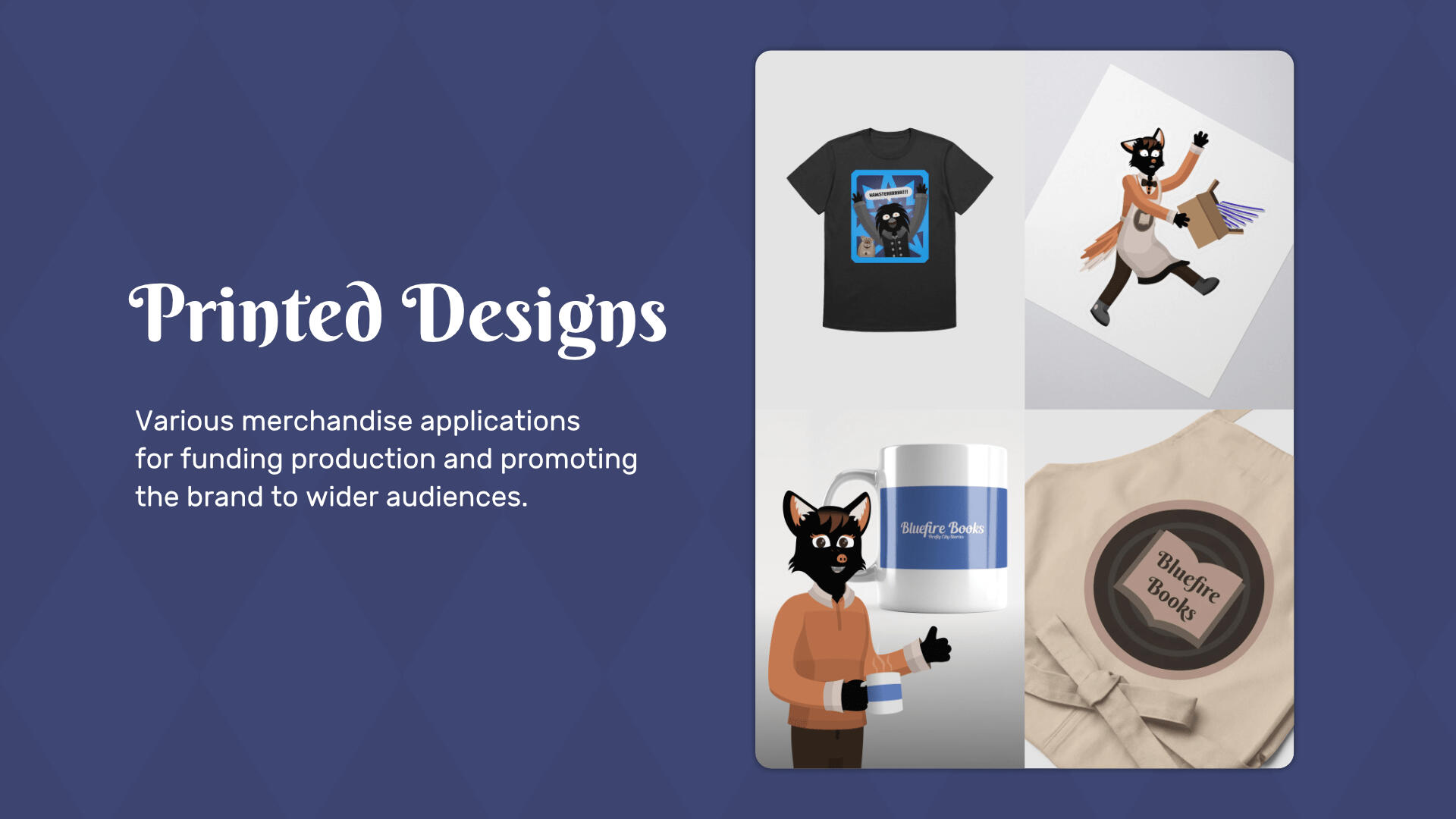
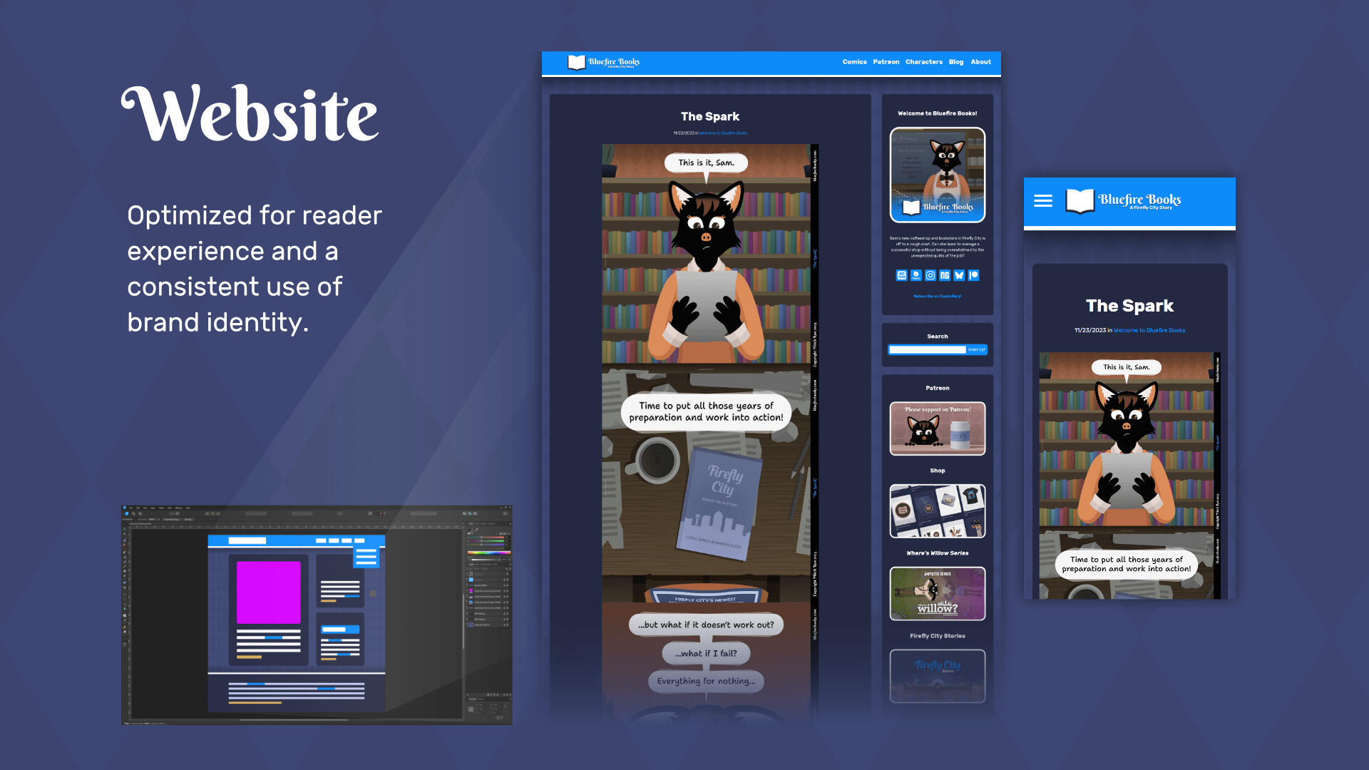
Bluefire BooksBluefire Books: A Firefly City Story is a comic series about a new resident of a big city and her quest to open a bookstore and coffeeshop. The series falls under the Firefly City Stories umbrella, and would thus need to fit with other projects while maintaining its own independent identity.
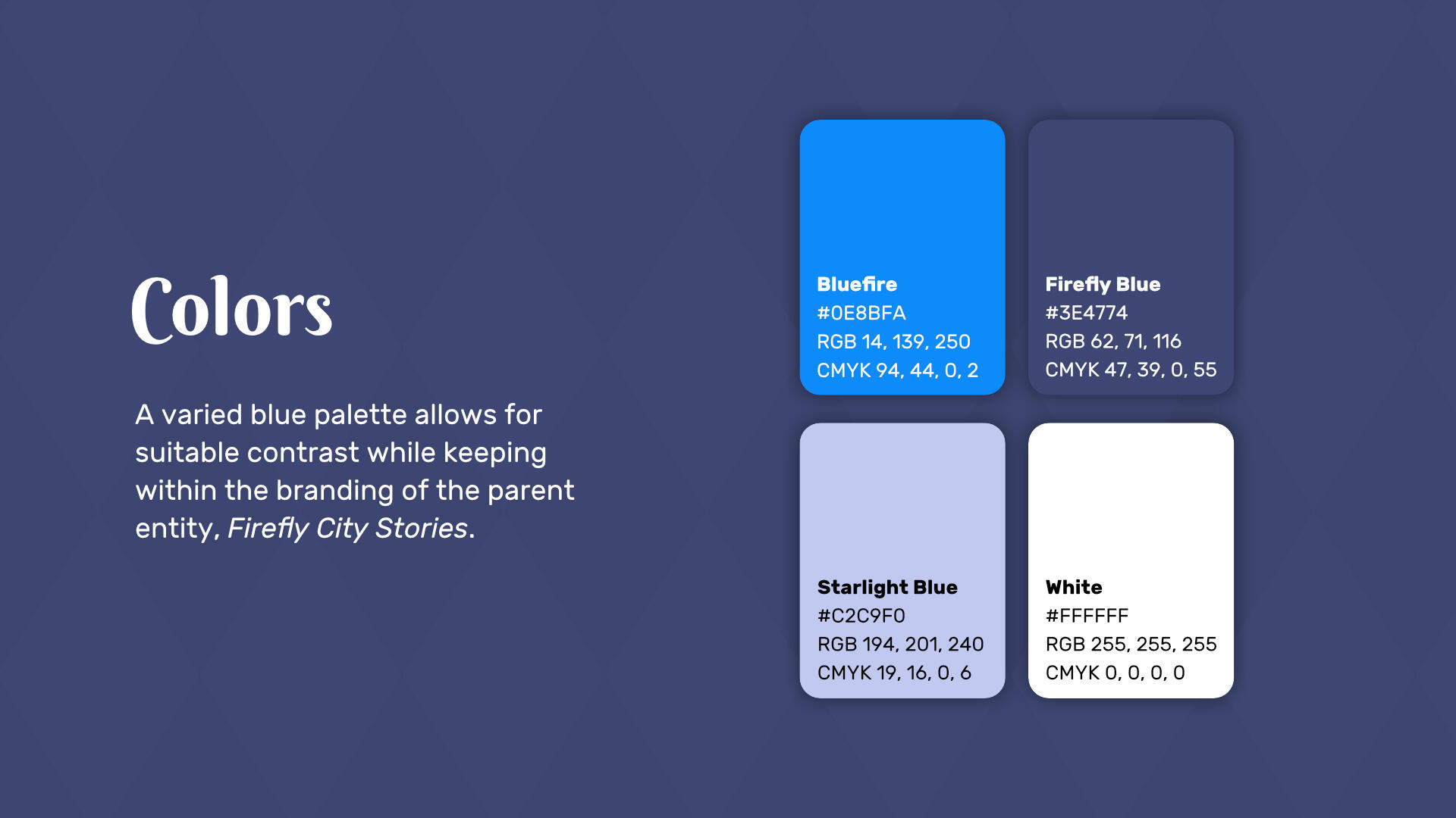
ChallengesAs this story features a shop in both the bookselling and coffeeshop industries, the ability to apply the brand to both fictional and real-life touchpoints both digitally and physically is key. Along with this, the brand needs to reach a wide audience of both new and old viewers while feeling complementary to its parent brand.
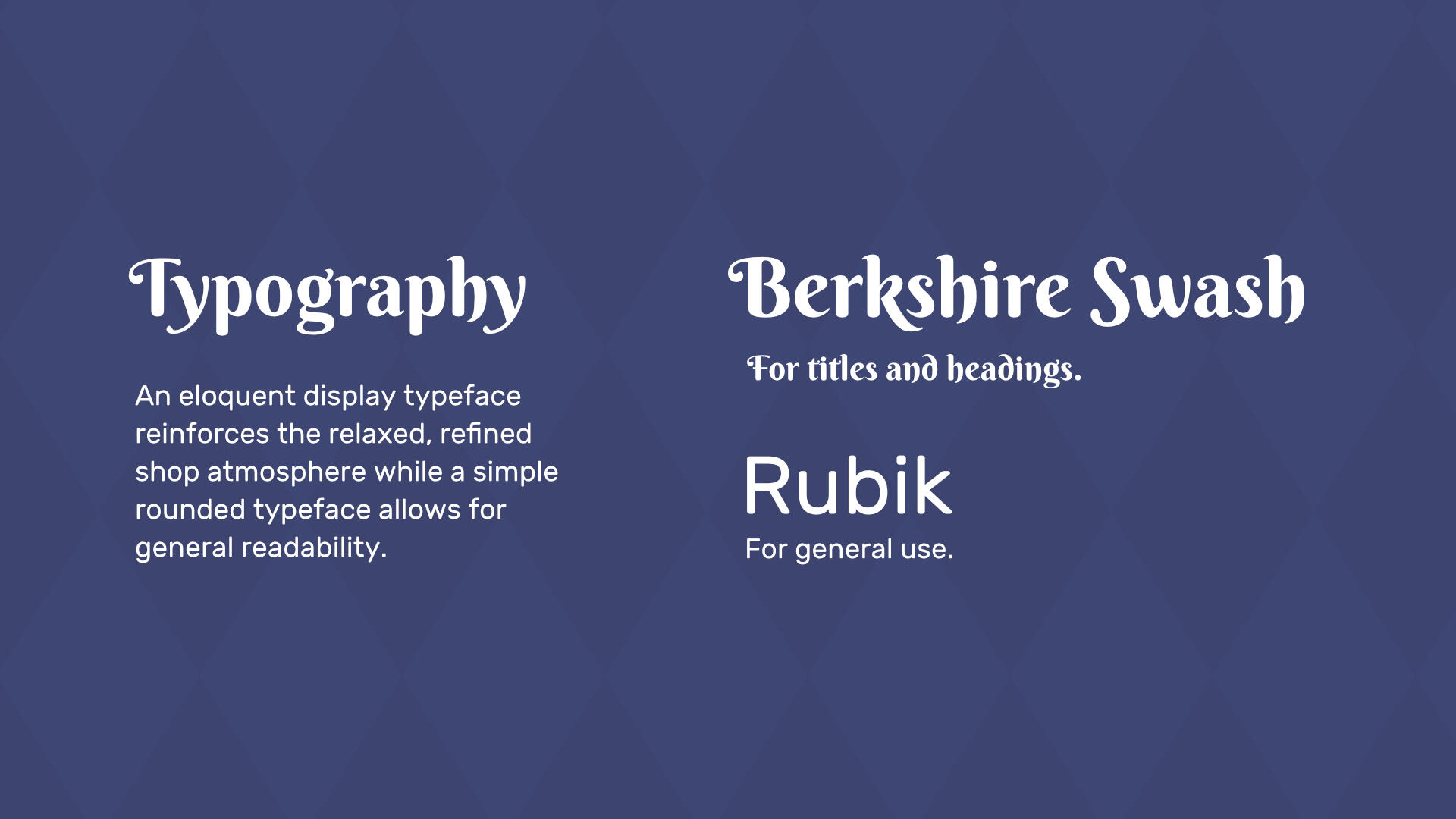
ResultsA versatile set of modular logos, simple yet contrasting colors, and readable typefaces was developed. This inherent adaptability allowed the brand to fit seamlessly into both fictional, real, digital, and print applications and thus become recognizable to audiences.

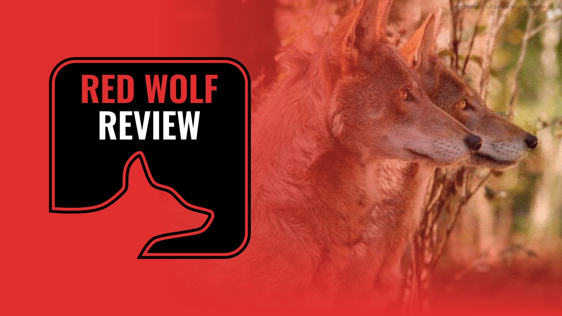
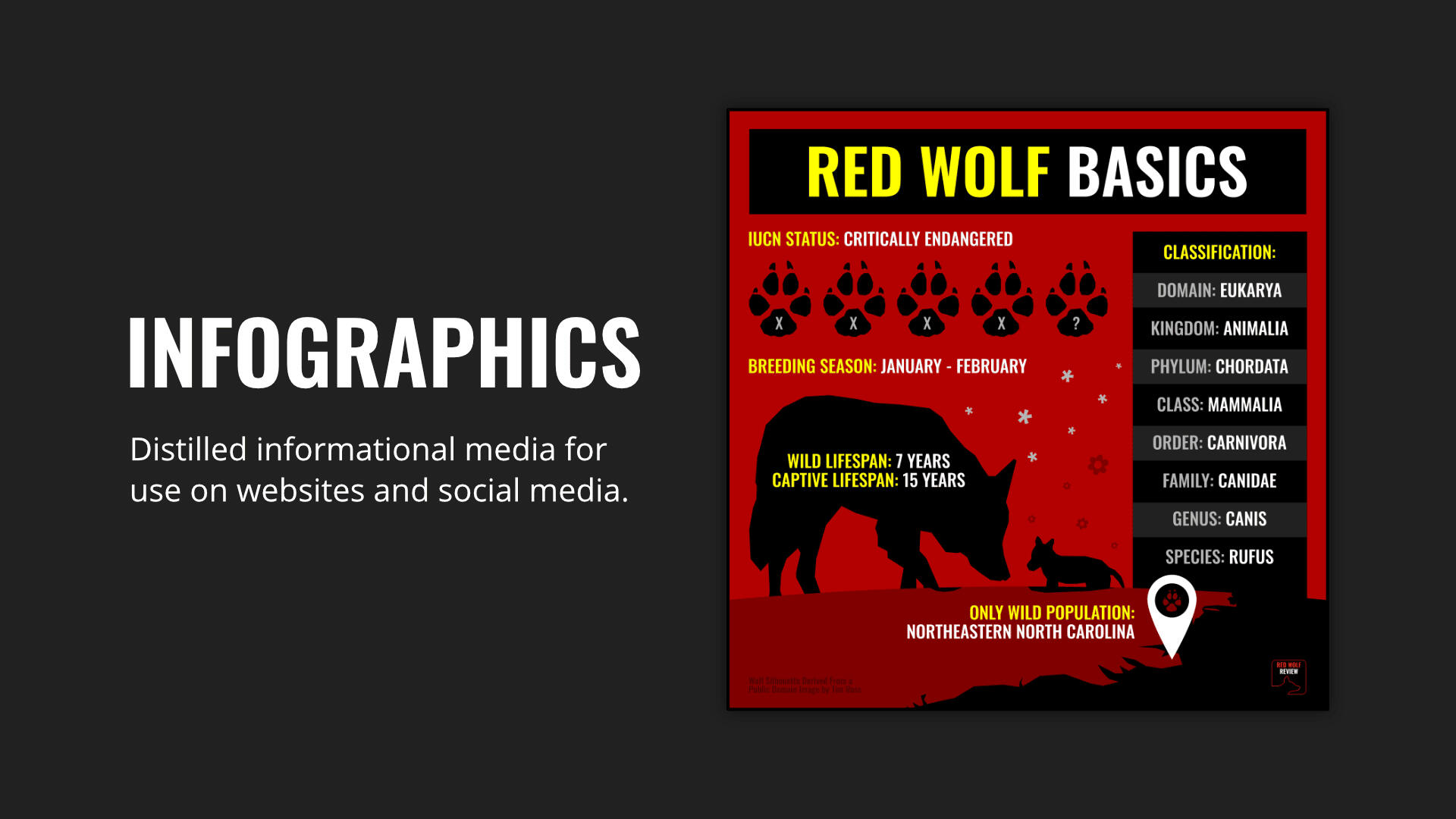
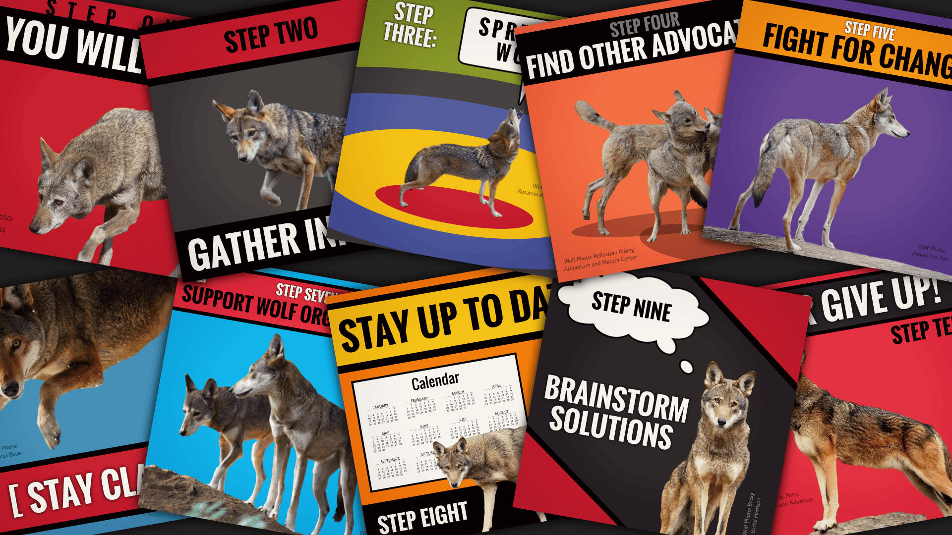
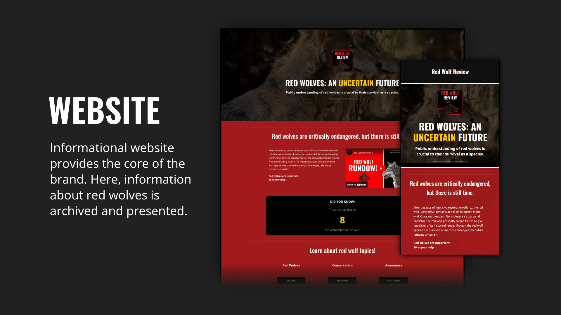
Red Wolf ReviewRed Wolf Review is an education platform founded in 2017 dedicated to spreading public awareness and knowledge about the conservation of critically-endangered red wolves. A rebrand of the platform was in order to modernize the look and feel of the brand and its initiatives.
ChallengesThis rebrand primarily revolves around a new logo design. The logo would need to be simple and scalable to go on infographics and various parts of a website, but also clearly show the platform’s name and have some red wolf symbolism.
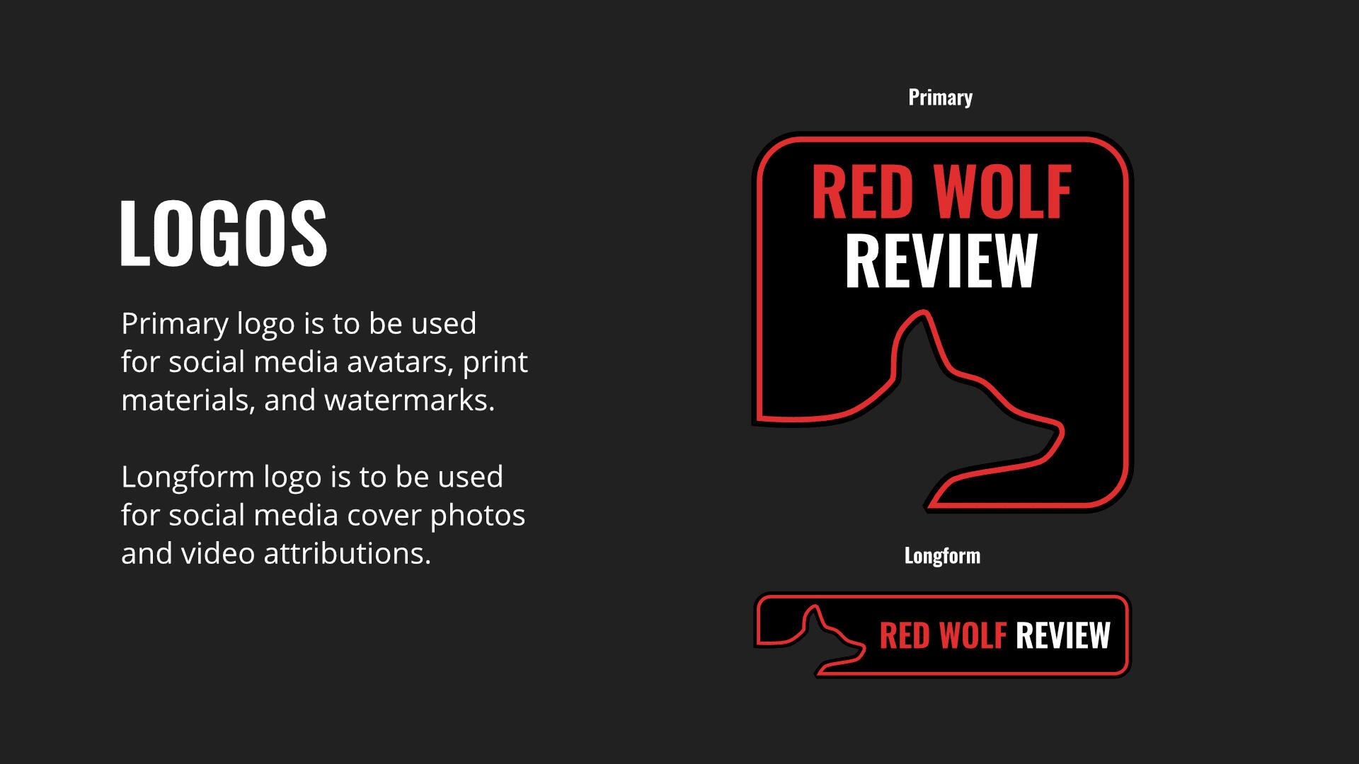
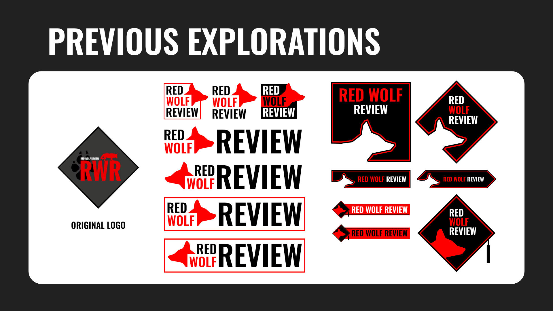
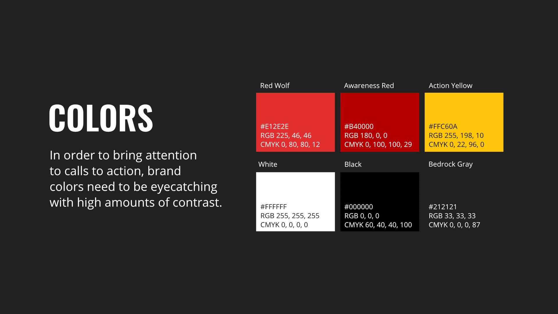
ResultsA successful logo redesign consisted of square and longform variants sporting bright red coloring, rounded corners, and a thin stripe to add definition against dark backgrounds. A set of brand guidelines accentuated the logo and allows for effective education and calls to action.


IceQuake MediaIceQuake Media (IQM) is a collection of original creative projects spanning a variety of formats and disciplines including illustration, animation, and music. The brand serves as a promotional, operational, and logistical envelope in which several sub-brands, projects, and initiatives can exist and benefit from one another.
ChallengesBranding for IQM needs to include references to the core of its role as an entity; a sum of several parts which each have their own identities, mediums, and stories. It needs to be be straightforward enough to avoid distracting from smaller brands while still being recognizable on its own.
ResultsThe IQM logo and branding guidelines centered around the theme of a building block system made out of books. Warm and cold complementary colors served to highlight the variety of projects within the collection, while also providing visual contrast. The overall combined effect was to create a recognizable, strong, and straightforward identity that worked effectively for its role.
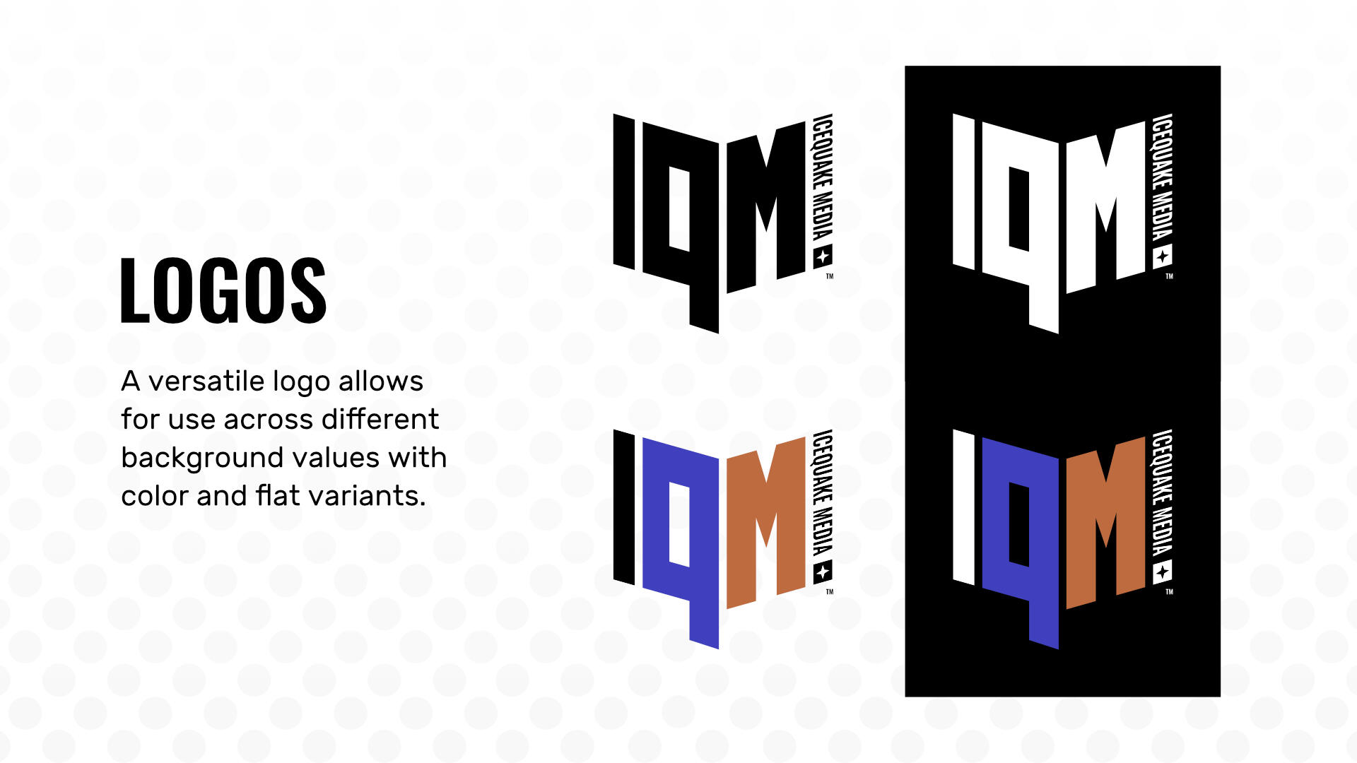
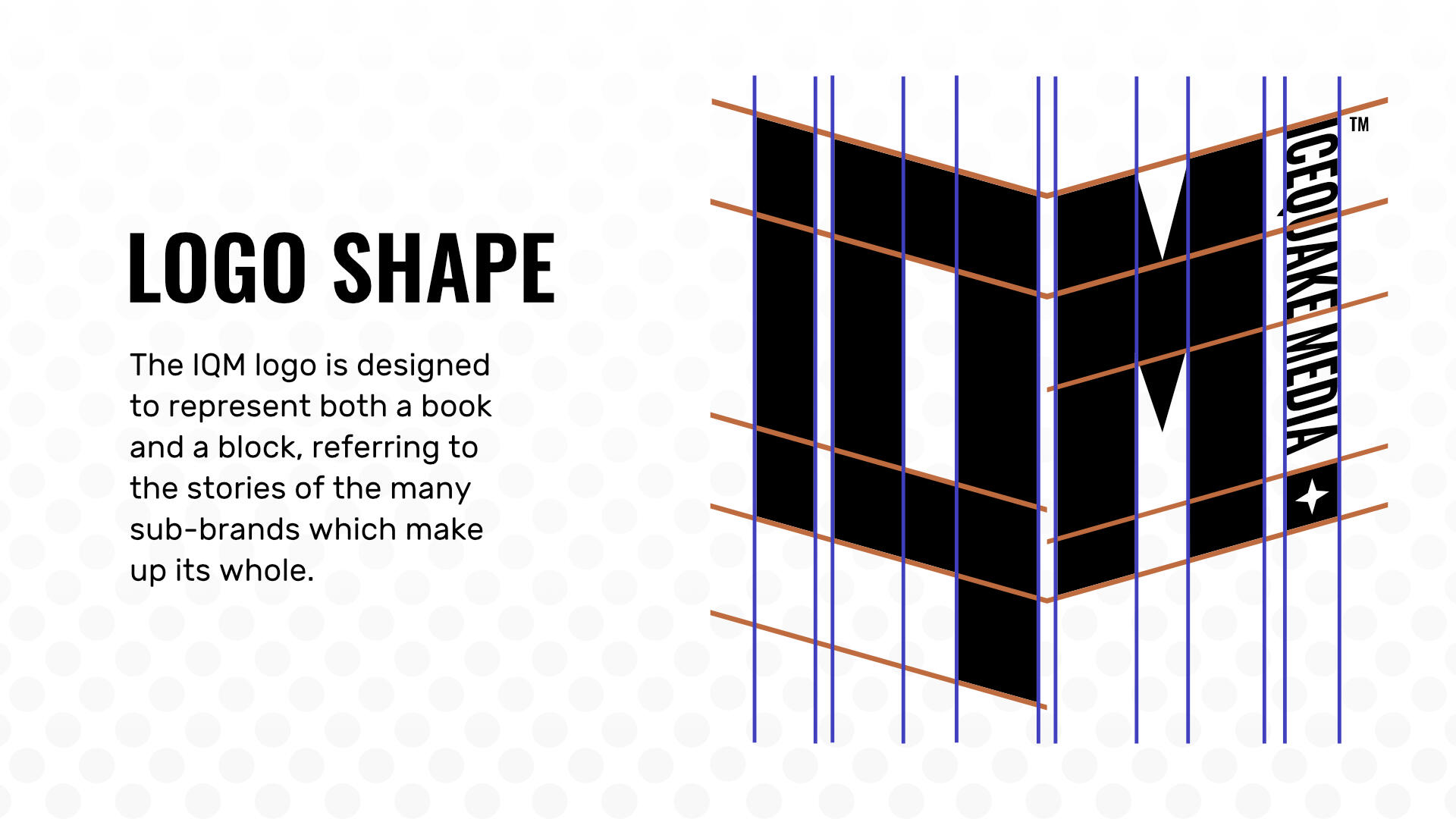
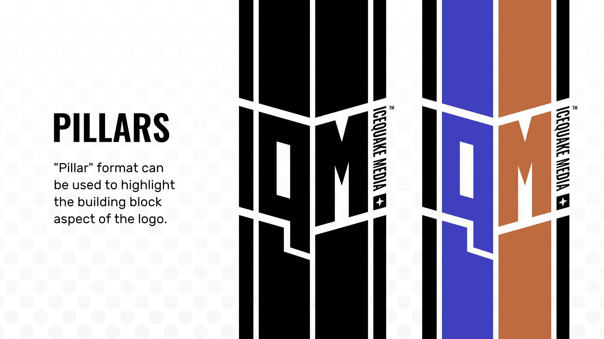
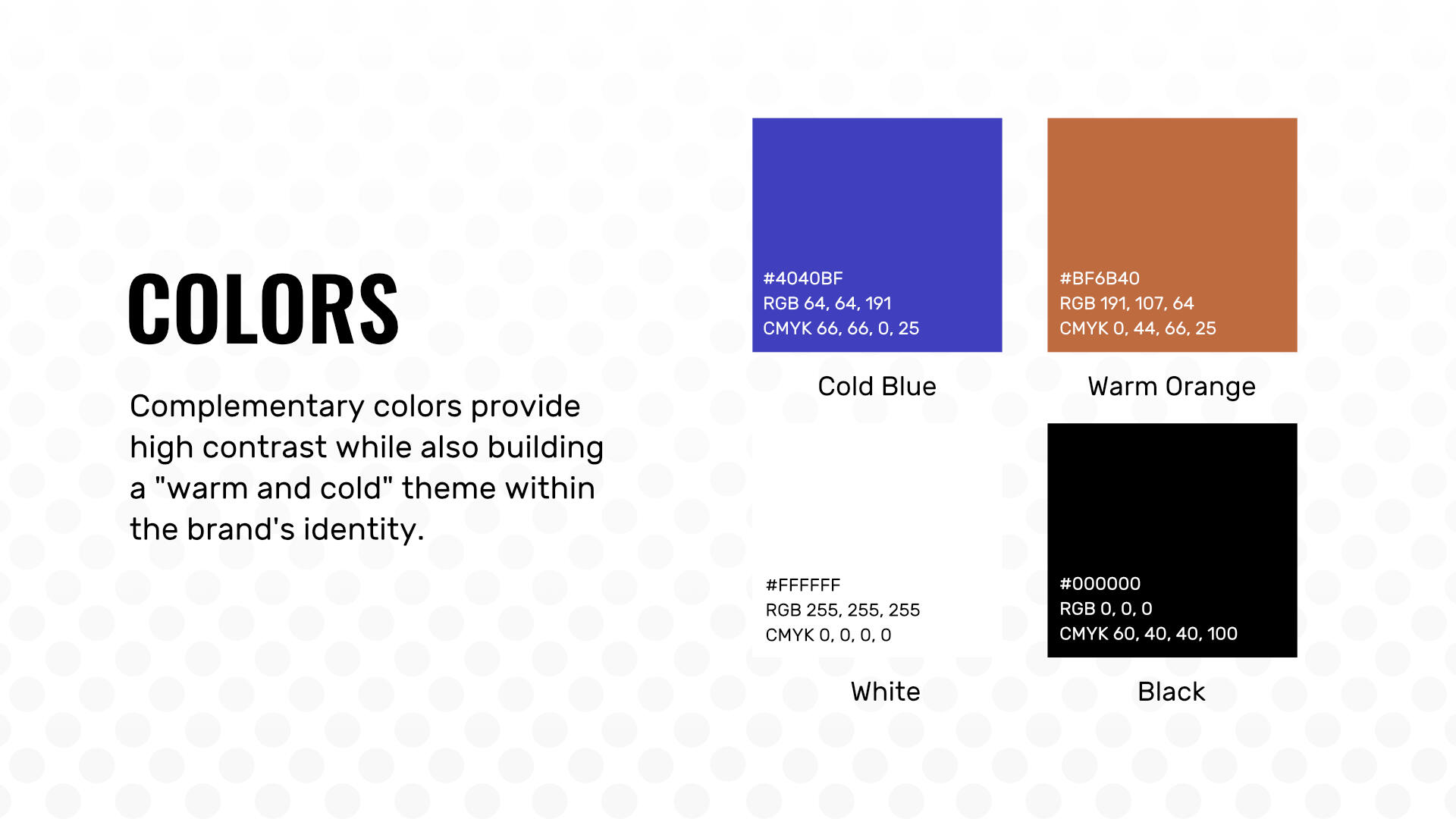
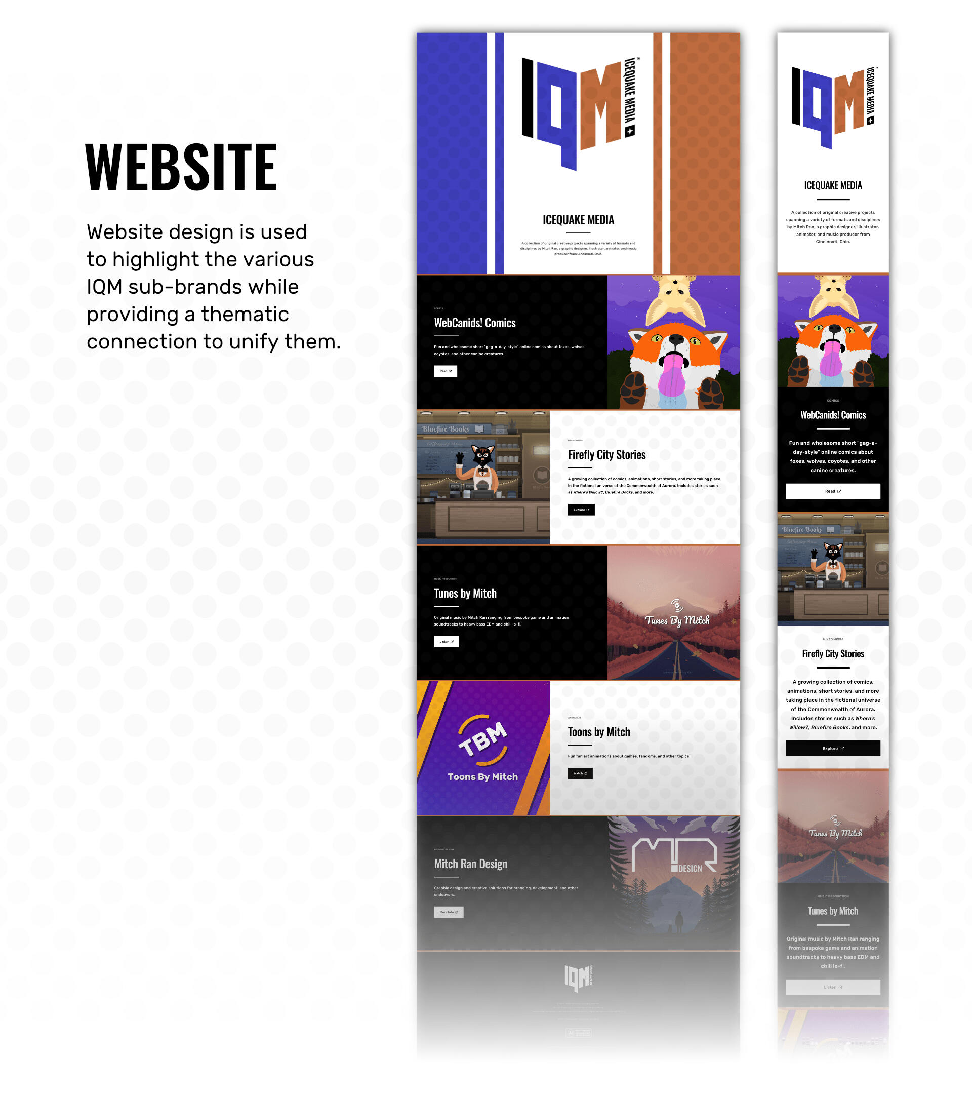
Illustration is an additional skillset that I use to elevate my design projects. Below are some examples of my work.
Alpine Sunset (2020)This is a piece designed to emphasize some of the themes that are important to me as a person and creator. Mountains, alpine forests, beautiful sunsets, and starry skies are some of my favorite things in nature, so I wanted to create a scene that incorporated them all. Work with lighting and contrast allowed me to create a dramatic scene with a natural rule of thirds framing setup. While the initial piece was created as a long horizontal banner, I also created variants in other aspect ratios.
Along the Waterfall Trail (2021)This piece was made to bring a place that frequently appeared in my imagination into a tangible, visible medium. Focus on light sources, rule of thirds, and relative color value allowed me to create a scene with immersive views and a sense of tranquility. While not its original purpose, the piece later served as a useful backdrop for a scene in episode four of Where's Willow? - A Firefly City Story after revision from its original monochromatic color scheme to a more realistic palette.
The Road Out of Fall (2021)Autumn is my favorite time of year, and thus I wanted to create a dramatic mountain piece that featured the season in a cozy way. Focusing on the rule of thirds, relative color values, and vanishing point, I created a scene in which an endless road reaches high up into the crisp mountain air. As with some of my other illustrations, this piece later was useful for a scene in episodes two and nine of Where's Willow? - A Firefly City Story.
Filament Cave (2024)Where's Willow? - A Firefly City Story required a large number of scenes featuring natural landscapes and geological features. One of the more notable examples was this cave, which tunnels deep into a rocky hill. Using the rule of thirds and a heavy focus on value to create a sense of depth, I was able to create an immersive scene that worked well as an animation backdrop in the fourth episode of the series.
Breathe (2020)This was a piece initially designed as a supplemental wallpaper for WebCanids! comics. Focusing on the use of calming blue colors, I aimed for a serene atmosphere. Reflections, gradients, and shading allowed me to add depth to the environment, and I eventually ended up with both a clear version and one featuring a red fox.
Willow's Room (2024)In contrast to some of the outdoor wilderness scenes in Where's Willow? - A Firefly City Story, the city scenes of the show required significantly higher numbers of individual assets and details. This scene is essentially two pieces; the city skyline outside of the window, and the lived-in room inside the walls. Focusing on vanishing point, light direction, and other aspects of developing perspective, I created this studio apartment scene that helped highlight the personality of the character (Willow) that lived within. The piece appears in episodes six and eight of the show, and has additional angles to supplement it in animation.
The Town of Sunset Valley (2024)In episodes five and eight of Where's Willow? - A Firefly City Story, a small mountain town makes an appearance. In order to maximize production efficiency, I needed to create a piece that could be zoomed in at different levels to be used in several different scenes and sequences. The result was a highly-detailed piece that features multiple buildings, road infrastructure, and several smaller sub-designs such as posters, shop signs, and vehicles.
Willow's Grandma's Kitchen (2024)As a scene appearing in a flashback in episodes six and eight of Where's Willow? - A Firefly City Story, this kitchen needed to feel both believably immersive and nostalgically distant at the same time. To do this, I created a monochromatic scene featuring a purple-pink memory color with a focus on perspective, value, and the rule of thirds. To contrast the memory, everything outside of the window is shown in normal colors.
Fire Lookout Tower 22 (2023)Where's Willow? - A Firefly City Story heavily features an abandoned fire lookout tower deep in a mountain wilderness area. In order to design this tower, I first started by building a wooden support structure with a series of simple rectangles with masked textures. From there, I used similar techniques to build a hut on top before building a natural scene around it using the rule of thirds and strong monochromatic contrast through value variations. The tower appears at multiple other angles throughout the entire show as well, and for those pieces similar techniques were used. Variations also include different times of day and weather.
The Firefly City Brilliance Library and History Museum (2023)The world of Firefly City Stories and Bluefire Books features a number of key locations that all require detailed illustration to be used as backdrops for both design, comics, and animation. The city library is one such location, and as such it needed to be a large, imposing building that stood out among surrounding skyscrapers. Using rule of thirds principles to develop the initial structure, details were gradually added and adjusted to create a scene with appropriate depth, believability, and versatility.
Animation is an extra method that I use to bring my design projects to life through movement. Below are some of my largest animated projects.
Where's Willow? (2025)Where’s Willow? - A Firefly City Story is an animated series about the ghost of a missing hiker who roams the wilderness of a vast national park. This series, which was a solo project aside from voice acting, started in 2020 and features my own artwork, animation, writing, music, and my own voice (among others).
Toons by Mitch (2021-2022)Toons by Mitch was a channel full of fan animations about video games. While the main idea was comedy, I often included a wholesome message in what I created to try and ensure the videos had some greater value beyond simple entertainment. Animations, voice acting, writing, and editing are my own.


